Tile Grout Color Ideas That Make Rooms Look Better
The tile may get all the attention in the showroom, but grout covers every joint between it. That makes grout color one of the biggest visual decisions in a tile project. The right tile grout color ideas can make a small bathroom feel calmer, give a kitchen backsplash more definition, or help a busy floor look cleaner between routine cleanings.
For most homeowners, the best choice is not simply the lightest or darkest sample. It is the color that fits the room's traffic, lighting, tile pattern, and the amount of maintenance you are comfortable taking on.
Start With the Look You Want the Tile to Have
Grout can either blend into the tile or create contrast around every individual piece. Neither approach is automatically better. It depends on whether you want the tile itself to read as one continuous surface or as a visible pattern.
A close-match grout creates a quieter, more connected look. White tile with soft white or light gray grout, for example, feels clean without making each grout line the focal point. This is a popular choice for larger-format floor tile, marble-look porcelain, and homeowners who want a simple backdrop that will not compete with cabinets, paint, or furnishings.
A contrasting grout makes the tile layout more visible. Crisp white subway tile with charcoal grout has a defined, graphic look. A warm cream tile with a deeper taupe grout can bring out a running-bond pattern without feeling as stark as black and white. Contrast works especially well when the tile shape is part of the design, such as hexagons, herringbone, penny rounds, or handmade-look ceramic.
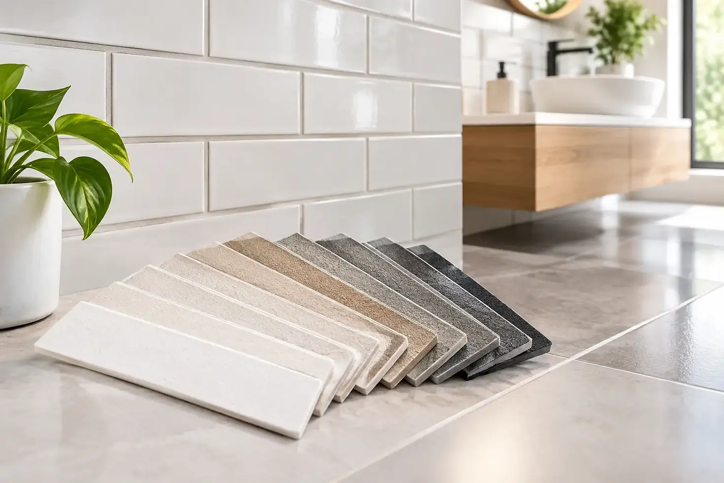
Before choosing, place the tile samples next to several grout samples rather than judging a color from a small paper chart. Grout often dries lighter than it appears when wet, and a color that looks subtle on a small strip may look much stronger once repeated across an entire wall or floor.
Tile Grout Color Ideas for Floors
Floor grout has to do more than look good. It needs to live with shoes, pets, cooking spills, bathroom products, and normal household traffic. A very light grout on a busy entry or kitchen floor can be beautiful, but it will show soil sooner than a mid-tone or deeper neutral.
Choose mid-tones for practical everyday floors
Medium gray, warm gray, greige, taupe, and light brown are dependable choices for many porcelain and ceramic floor tiles. They hide everyday dust and minor discoloration better than bright white while still keeping the room open and light. Mid-tone grout is often the practical sweet spot for family homes.
For gray stone-look tile, use a grout that falls near the middle of the tile's color range instead of matching its lightest vein. This keeps the floor cohesive and makes the grout lines less noticeable as the room sees daily use.
For beige, travertine-look, or warm wood-look tile, look at sand, mushroom, almond, or taupe grout. Cool gray can make warm tile look slightly disconnected, especially under warm indoor lighting.
Use darker grout when definition and cleanup matter
Charcoal, dark gray, espresso, and deep brown grout can work well with light tile in mudrooms, laundry rooms, and high-use kitchen floors. The contrast outlines the pattern and makes dirt less obvious at a glance. The trade-off is that dark grout makes layout imperfections, uneven spacing, and lippage more visible. Professional installation and careful planning matter more when every line has contrast.
Dark grout is not maintenance-free. Soap residue, mineral deposits, and light-colored cleaning products can show on it. In many North Texas homes, hard-water minerals are a consideration in bathrooms and showers, where a medium neutral may be easier to live with than very dark grout.
Backsplash Grout Colors That Work With Cabinets
A backsplash is usually where homeowners have the most freedom to use contrast. It gets less foot traffic than a floor, and grout can help tie together cabinets, countertops, hardware, and wall paint.
White or off-white grout with white subway tile remains a reliable option for a bright kitchen. It keeps the backsplash soft and lets the cabinets and countertop lead the room. For warmer white cabinets, avoid a stark blue-white grout. An ivory, biscuit, or warm light gray is often a better fit.
Gray grout with white tile adds definition without the full drama of black. It works well in kitchens with stainless steel appliances, gray veining in quartz or granite, or black hardware. If the countertop has warm gold, beige, or brown movement, a mushroom or light taupe grout may create a more connected result.
Black grout can make white tile feel modern and tailored, particularly with black-framed windows, matte black fixtures, or darker cabinetry. Keep in mind that it becomes a major visual feature. It is a better fit for a deliberate high-contrast design than for a kitchen where you want the tile to disappear.
With colorful tile, matching grout is often the safest path. A close color match lets the tile's glaze and shape stand out without creating a grid that competes with it. If an exact match is unavailable, choose a neutral pulled from the tile's undertone, such as warm gray with muted green tile or soft cream with terracotta.
Bathroom Grout Choices Need Extra Thought
Bathrooms combine moisture, soap, hair products, makeup, and frequent cleaning. Grout color should support the look you want, but it should also make regular upkeep realistic.
For shower walls, a close-match grout gives the space a clean, uninterrupted feel. This approach is especially effective with large-format porcelain tile because fewer visible grout lines can make a shower feel larger. A medium-light gray with white or marble-look tile is a practical alternative to pure white when you want a softer maintenance profile.
For shower floors, small mosaic tile is common because the added grout joints improve traction. Here, bright white grout can discolor faster than homeowners expect. Soft gray, silver, warm gray, or taupe usually offers a better balance of appearance and practicality.
If you are using natural stone, ask your flooring professional about the right grout and sealer for the material. Stone can vary significantly from piece to piece, and grout color may look different against a porous or textured surface than it does on porcelain.
Let Tile Size and Pattern Guide the Decision
The smaller the tile, the more grout you will see. A 12-by-24-inch tile floor may have a modest amount of grout, while a penny tile shower floor can have grout across a large share of the surface. With small mosaics, a bold contrast can become much busier than it looked on a sample board.
Large-format tile gives you more flexibility. Matching grout minimizes the joints and creates a more expansive appearance. A contrasting grout can still work, but it will draw attention to every line, so straight layout and consistent spacing are essential.
Patterned tile also deserves a quieter grout choice in most cases. If the tile already has movement, print, or strong color variation, grout that closely relates to the background color keeps the room from feeling crowded. Save strong contrast for simple, solid-color tile where the geometry is the design feature.
Test Grout in the Room, Not Just the Showroom
Lighting changes color more than many homeowners realize. A gray grout can read cool and blue in a north-facing bathroom but warmer under kitchen pendants. Bring samples into the actual room and look at them in morning light, afternoon light, and evening artificial light.
It also helps to view samples beside the materials that are staying: countertop, cabinet door, paint swatch, vanity, or flooring. The goal is not always a perfect match. It is a combination that looks intentional.
If you are deciding between two colors, choose the less dramatic option unless contrast is central to your plan. Grout covers a lot of area over time, and a slightly softer choice is often easier to enjoy for years.
Do Not Forget Grout Performance
Color is only part of the decision. The right grout product and installation quality affect stain resistance, cracking, cleaning, and long-term appearance. Cement-based grout may need sealing depending on the product and location. Higher-performance options can offer improved stain resistance, but the best choice depends on the tile, joint width, and whether the area is dry, wet, or heavily used.
Professional installers can also help you avoid common problems, including choosing a color that clashes with tile undertones or selecting grout that is not appropriate for the joint size. At Fast Flooring DFW, an in-home consultation makes it easier to compare tile and grout samples under your home's real lighting before installation begins.
The best grout color is one you will still appreciate after the first spill, the first deep clean, and a few years of everyday life. Choose a shade that supports the room's design, then give it enough practicality to keep the space looking like it did on day one.


Comments